Problem statement
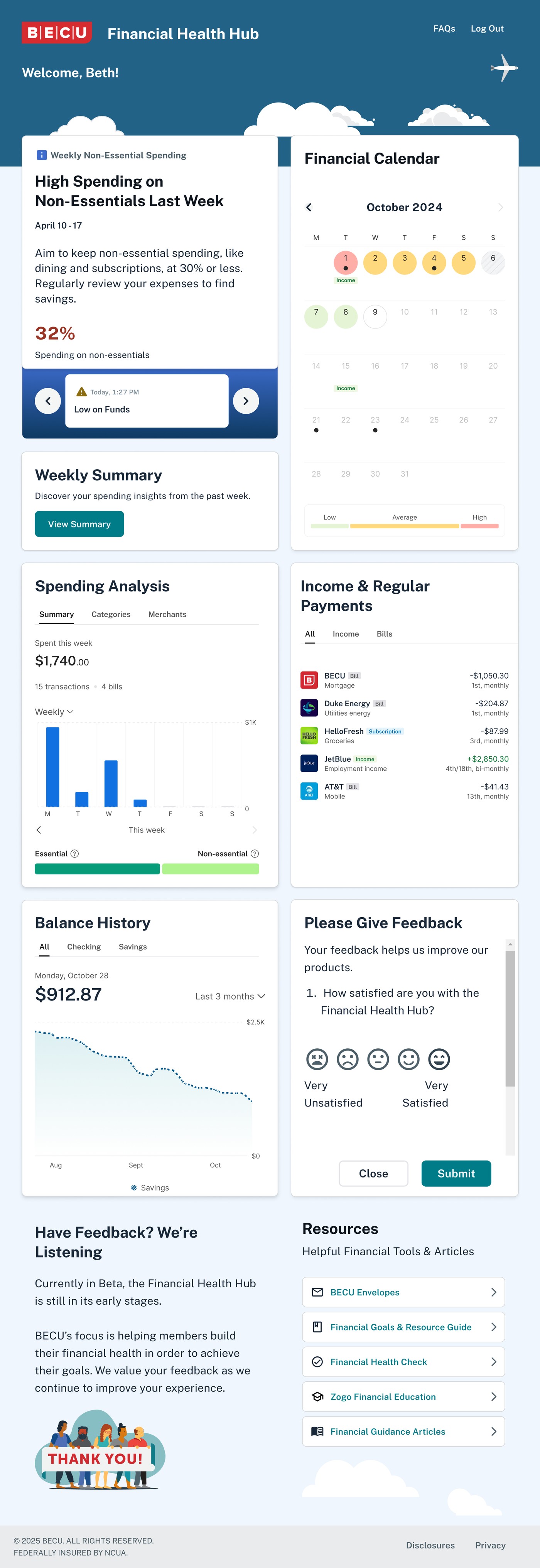
Members struggled to find what they needed because the platform wasn’t organized around how they think about money.
How might we organize the Financial Health Hub so it matches how members already think about their money?
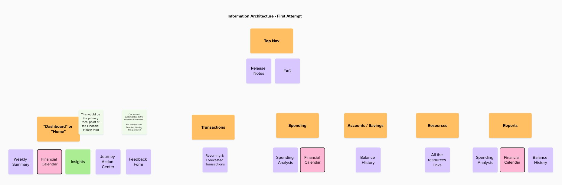
Creating a site map
After leading a workshop with the Financial Health team, I drafted a site map that reflects how a paycheck-to-paycheck member thinks as they move through the website.
Design recommendations
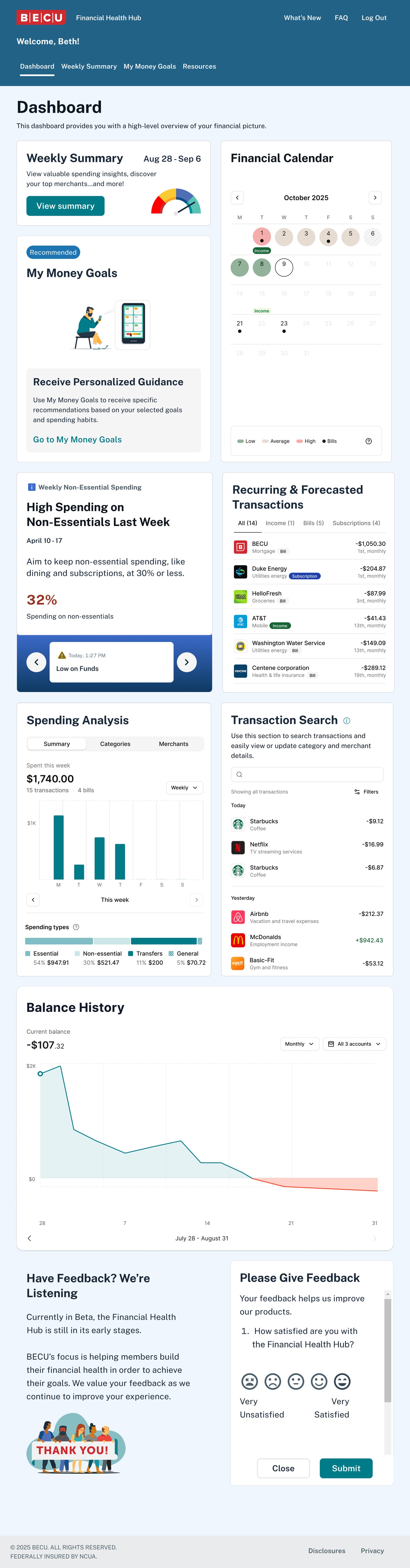
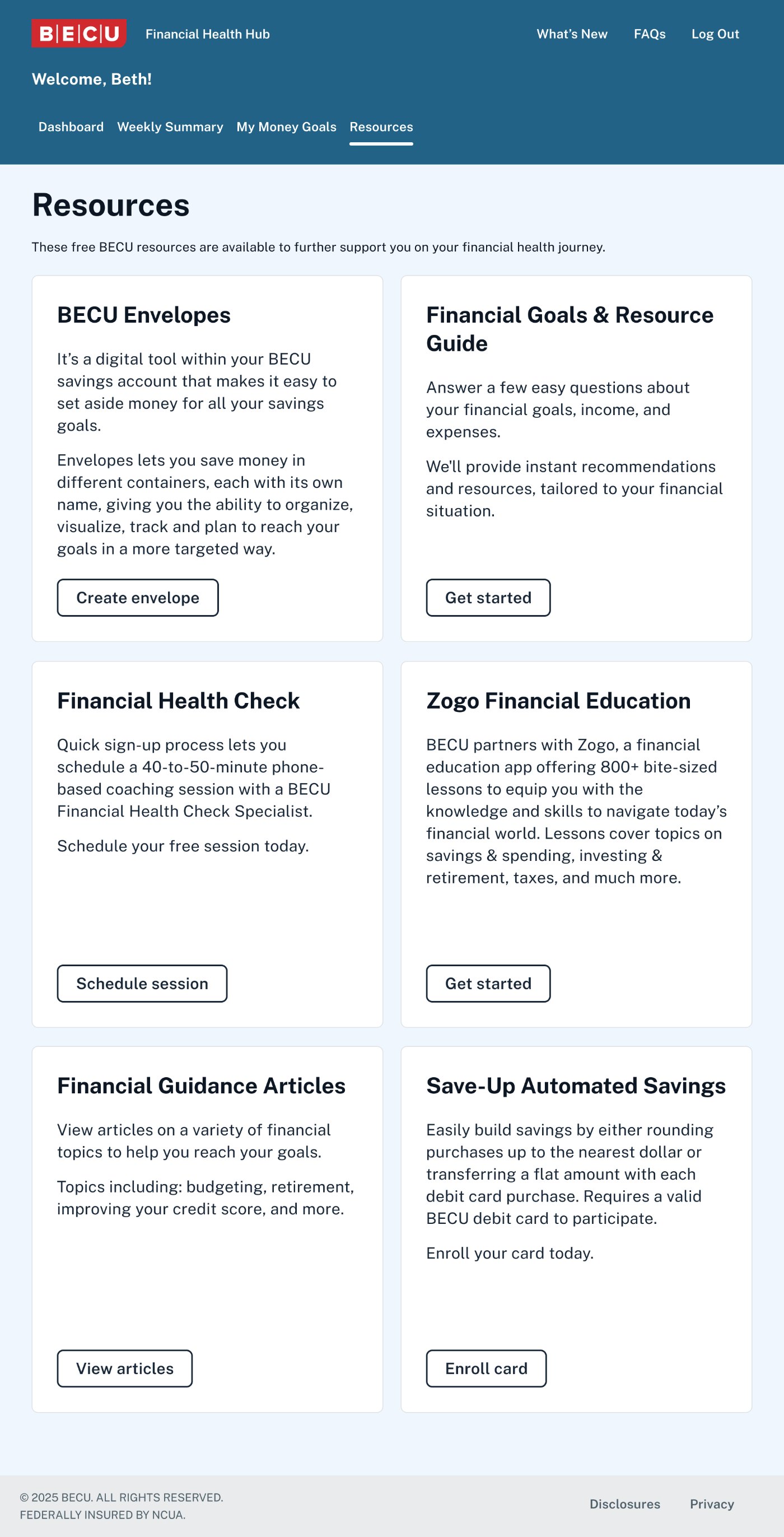
Over two weeks, I iterated on several layouts and recommended a redesign that better matches how members think about their money.
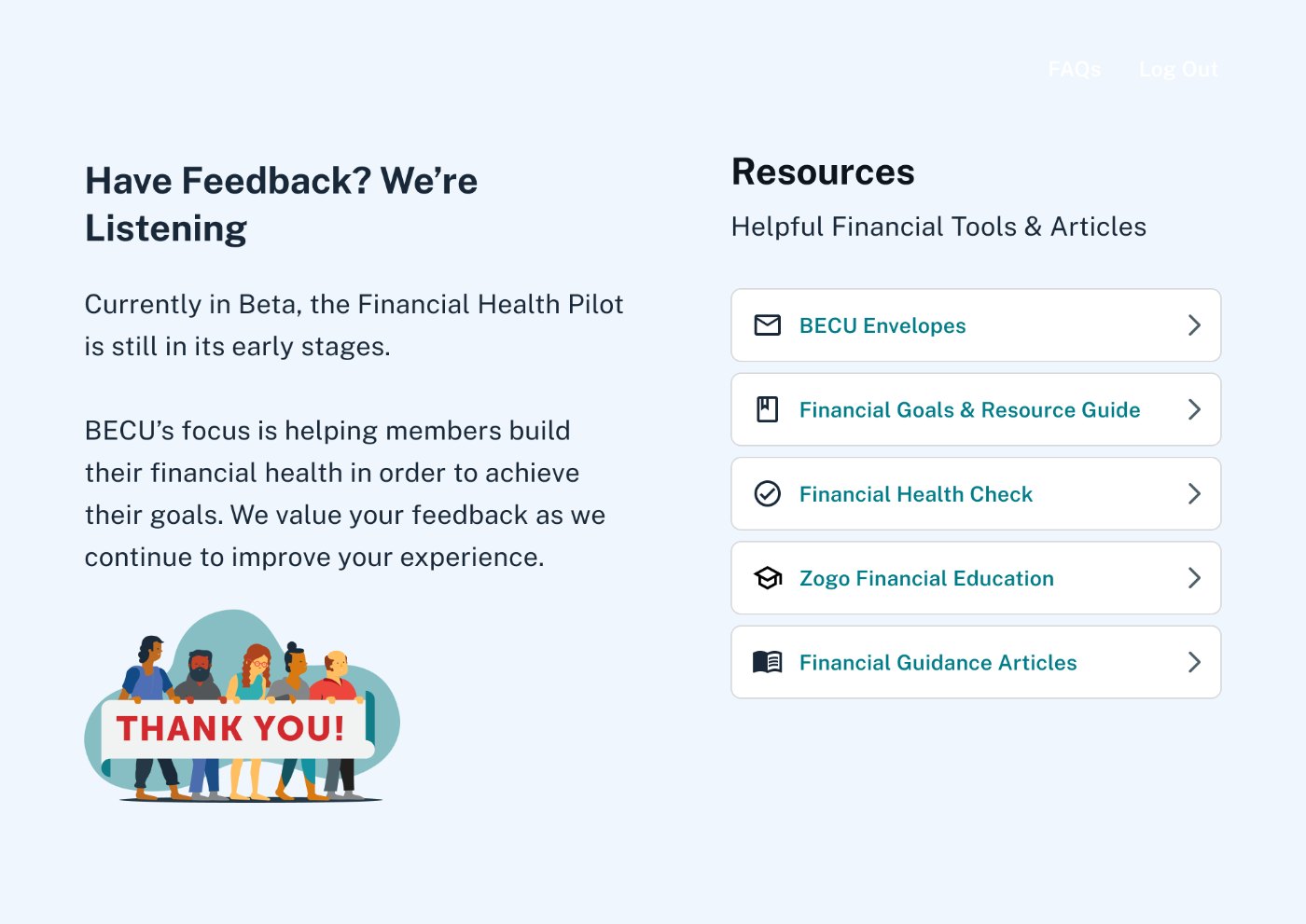
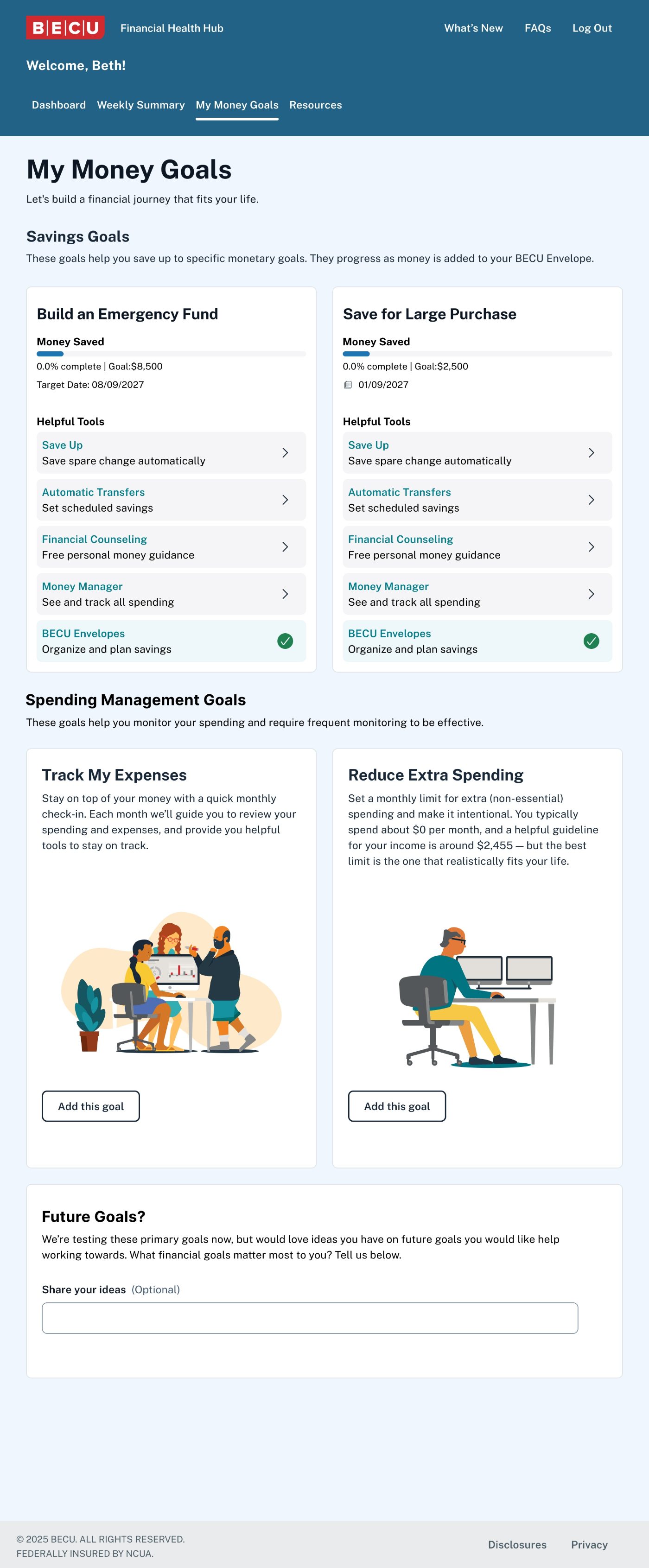
With the design constraint of all widgets needing to remain on the dashboard, I recommended adding tabs for each section. This way, the Weekly Summary, My Money Goals and Resources each get their own page for members to explore in more detail.